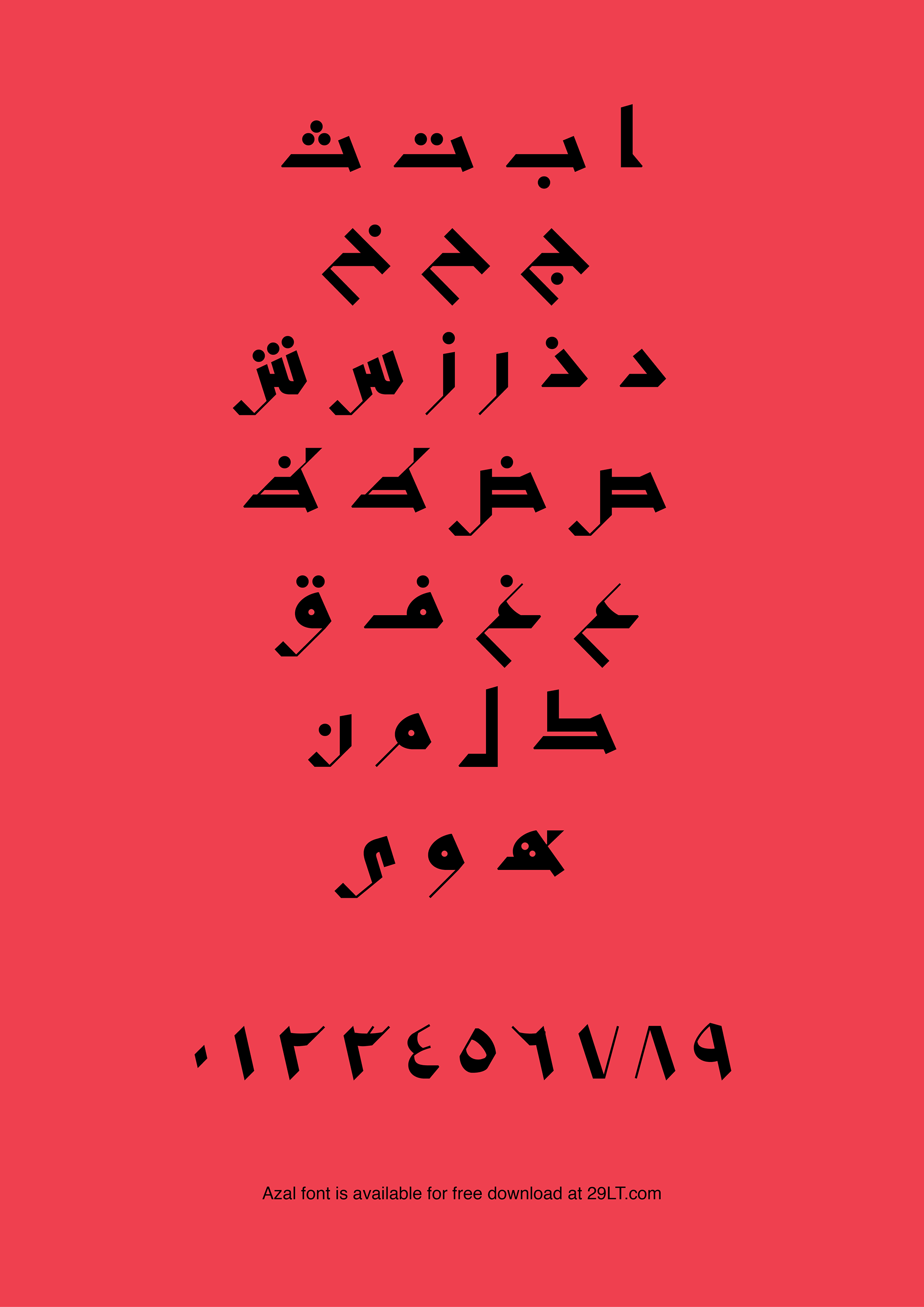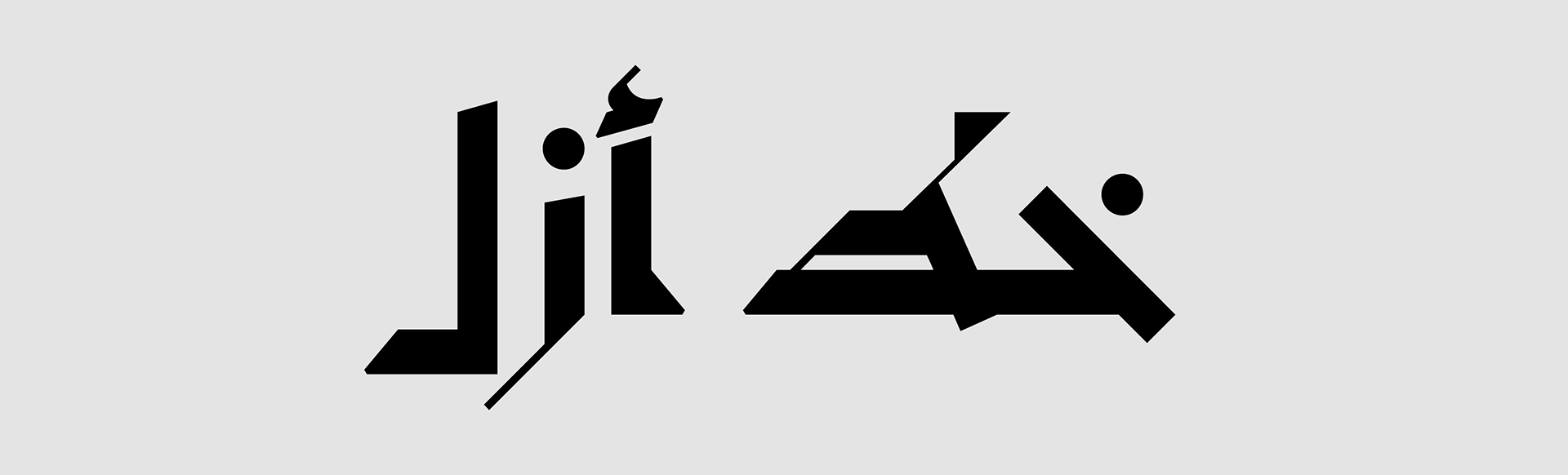
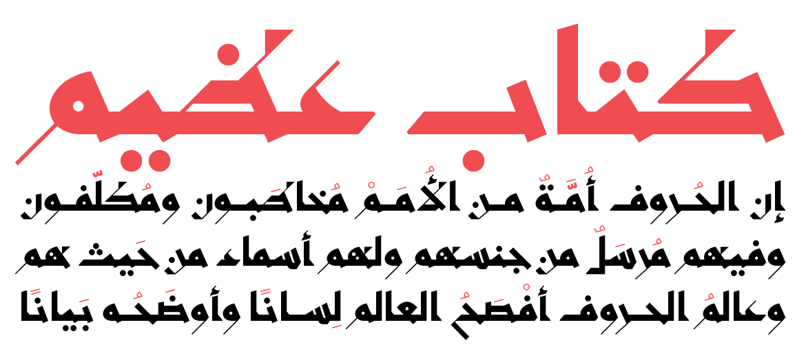
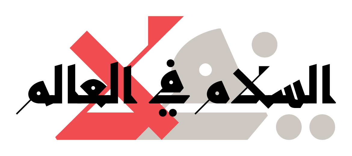

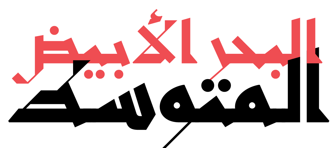
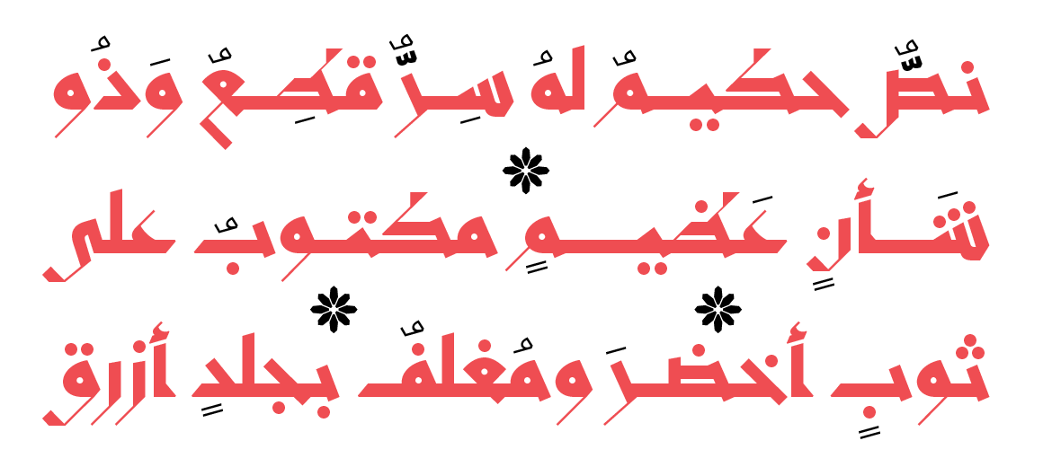
أزل هو خط هندسي متماسك مع ميزات عربية معاصرة مستوحاة من المخطوطات الكوفية الشرقية القديمة ومرسومة بنهج حديث. فعلى أي حال، تعني كلمة «أزل» باللغة العربية قديم. إنه خط عرض يتميز بخصائص تصميمية بارزة ومتماسكة. إن هيكلية كل حرف مصممة من أجل خلق توازن بين أشكال القاعدة الصلبة والنهايات الطرفية الأنيقة. تعد هيكلة الخط مزيجا مما يلي: تباين كبير بين ضربات القلم السميكة والرقيقة، ومخطط هيكلي قطري، وعلامات صغيرة، وخط قاعدة سميك وأطراف حادة تتناقض مع نقاط دائرية. يتوافق هذا الخط مع المخطوطات القديمة التي كانت ترسم يدوياً بواسطة «القلم» - وهو نوع من الأقلام، مصنوع من القصب المجفف ومستخدم للخط الإسلامي. ومن أجل التشديد على استخدام هذه التقنية، تتمتع كل مجموعة. من هيكليات الحرف العصرية بزاوية مختلفة تمنح الخط ميزة ديناميكية
Azal is a sturdy geometric font with contemporary Arabic features that are inspired from the old Eastern Kufic manuscripts and drawn in a modern-day approach, and old is, after all, what Azal means in Arabic. It is a display font with prominent and sturdy design characteristics. Each letter structure is designed to create a balance between solid base forms and elegant terminals. The font structure is a mixture of: high contrast between thick and thin pen strokes, diagonal skeleton, small counters, thick baseline and sharp edges contrasted by circular dots.
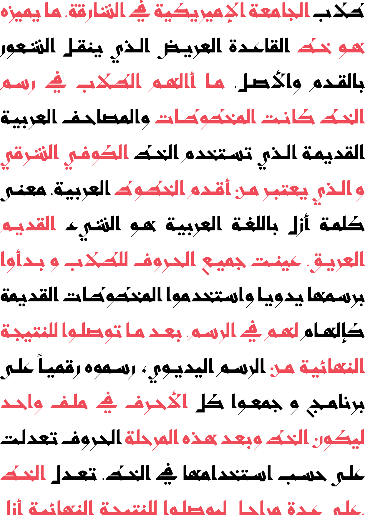
At the start of the project letters were distributed among 17 students in the American University of Sharjah to be worked on, they were curated every week by the professor to review their progress, and provide feedback on the changes that were needed to be made to achieve the final result of the font Azal. After the drawing phase, type design digital techniques were discussed in class which enabled each student to draw their letters on the Glyphs App. All the letters were compiled on one file and recurrent design and feedback sessions were conducted in class to make the necessary alterations that made Azal come together.